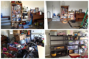
Furniture placement in a room is key to how a room looks, feels and functions. Too Often we place pieces in an incorrect relationship to other pieces or to the room as a whole. It can give the room either a cramped and overcrowded feel or it can make a space feel disconnected and not in cohesive. A room needs cohesion, and this is most effectively achieved through color, style, texture and an overall look and feel to the pieces in the space. Not that everything has to match, that can be a mistake as well. And sometimes very disparate pieces can work well together as they interact, playing off each other and creating a unity out of their differences.
I recently worked with a client in his one bedroom apartment and we moved pieces from one room to the next and created a new work area in his living room and purged unnecessary items We created a designated zone for his desk and computer items, freeing up his dining table for eating and socializing purposes. He was thrilled with this subtle change that made a huge difference in how he felt about the space and how he could work there more efficiently. We freed his bedroom to function more as a place of rest rather than work, and we cleared space in his closet. With these subtle changes, we made some lasting shifts in how he felt about where he lived and worked.
Take a look around you. Bring in a fresh pair of eyes. Often we have pieces of art that are scattered about or have surfaces full of photographs that would make a much stronger impact if they were grouped together on a wall, creating a statement through their connection. This frees up horizontal space, giving the eyes a place to rest. With art of a similar style, say, world art, we can create a “story” by grouping it into one place and bringing visual impact and interest to the pieces that now play off one another.
I had a client recently whose problem was too many things on every flat surface and around the perimeter of the room. I edited and eliminated a lot of stuff she didn’t need and created space for the remaining pieces to be enjoyed more fully. The relationship of the items could now interact and dialogue with each other thus enhancing their presence. By eliminating many pieces on the floor, it opened up the space and gave things a chance to “breathe” and be seen for themselves. Often editing is more urgent more than adding.
Take some time to look around your space and experiment by shifting your furniture or moving artwork to a different space and see what happens. You’ll be pleasantly surprised.

