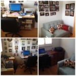
Furniture layout in a room is crucial to how the room functions in regards to its usability and aesthetic presence. Many people struggle with furniture placement and aren’t sure how best to utilize their furnishings.
Create zones/specific areas. Larger rooms are often misused because people don’t realize that the space can be divided and used for different purposes. I have one client who has a large room with a fireplace and built in bookshelves on one wall and sliding glass doors on the other with more built in shelving and cabinets on the other which houses some of her children’s artwork and has her daughter’s art table and supplies located there. She pushed her couch against the empty wall opposite the glass doors and has a small bookshelf for her daughter’s books and a large area rug. The space is being ineffectively used because there’s no where for people to gather while the fireplace area is going to waste. What I would recommend here is move the couch to the center of the area rug, facing the fireplace, add a coffee table and either 2 club chairs or a loveseat and end tables and create a “zone” there where people can visit and gather. I would more clearly delineate her daughter’s play area with an appropriate area rug that can withstand art supplies and make this room more inviting by adding artwork to to the walls and create a clearly demarcated gathering space for family/friends and play area for her daughter. Currently the room is a vast open space and doesn’t lend itself to creating connection and conversation.
Give space around things so they can breathe and people can move around them. Too often people crowd too much stuff into a space and they also don’t allow for enough space in which to maneuver around things. Did you know you need 36″ around a dining table from the wall and other furnishings? You should allow 15-18″ between a coffee table and sofa? Is there 6″ between chairs at a dining table and if there is an area rug beneath it, is there 36″ on all edges from the chairs so they don’t catch when pulled out? Pathways are essential in a home and office so we can move easily from one place to the next and when they are impeded, it can cause frustration as we constantly bump into or trip over furniture. On the other end of the spectrum, is there too much space between furnishings so they feel isolated, like they don’t relate or connect? Too often people layout furniture in a way that I call “the Stick Up” where all the furniture is pushed up against all the walls as if they are being held up. Again, move pieces into relationship to one another so they interact and create a connection.
Is there too much or too little furniture? More often than not, I meet clients who have downsized from a large home to a condo or smaller house and they aren’t willing to part with their various pieces. They end up piling furniture behind one another so every nook and cranny has something filling it and the pieces go unused. We need to edit out the extraneous items and keep just what we need. A client recently downsized to a condo and had so much furniture, the rooms were cluttered to overflow and couldn’t be used or enjoyed. On the other side, some people need more furniture so the room doesn’t look like a lonely space, again, with no connection between items and not enough storage space, or surface space to use for drinks, lamps, and accessories.
Review your living and work areas and make sure they are serving your needs in regards to the functionality and usability of the space as well as the aesthetics so your areas are both beautiful and useful. If you should need some help with your layout, give us a call at 510.501.1213.

