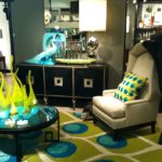
Interior Design: Mixing and Matching Styles
 An eclectic room comes to life with the play of different styles, creating visual interest and engagement. When a Tuscan urn sits atop a stone pedestal next to velvet drapery we may find ourselves intrigued with the ancient and rough hewn nature of the urn juxtaposed with the soft, furry surface of velvet. Mixing and matching marries differing eras, colors, finishes, textures and sizes and shapes to create cohesion, unity and harmony. So how does one go about doing this effectively?
Too often what I see is clients purchasing table top decor, lamps, artwork from a variety of big box stores and throwing it all together or putting so much of it in one area that it ends up competing and detracting from each other and cancelling the other things out. It ends up a hodge podge of dreck.
Let’s start with the walls. Picking the right paint color is essential for the furniture and furnishings you have. Too often people think they have to match everything together from the walls to the sofa to the area rug. Not so. This just creates a bland palette of the same. What makes a painting or photograph interesting is contrast in value, ie, how much light or dark exists. When all the values are in the same range, you get a washed out feel that looks unappealing and uninviting. Contrasts are key for the colors and values you have in a room. (One note about light and dark colors–dark colors absorb light while lighter ones reflect it). A dark brown leather sofa against a dark brown wall does nothing for either. In this situation I used lighter artwork and colorful, patterned pillows, area rug and a throw that broke up the dull brown on brown palette and created a warm and inviting feel. I also added off-white drapery with a textured fabric and put a mirror in the corner and uplight that brightened it up considerably.
Next we need to create relationships with the pieces so they relate and interact with each other to create cohesion. Just like for humans, relationships are essential for furnishings to fit and work together. When items in a room don’t work it’s because their relationship to each other is disharmonious. For an instance, imagine an oversized brown leather sofa, coffee table and club chair crammed together while sheer curtain panels hang limp behind them and random prints dot the wall. The furniture pieces are too large and don’t fit the space, the curtains can’t hold their own with the furniture and the artwork has no relationship between each other. By resizing the pieces and finding a more substantial fabric and connecting the artwork, the area starts to work as a whole unit and not disparate pieces.
A key component in mixing and matching is editing, learning to pare out what’s not needed and keeping only the essentials. Too often people have a mixture of things that don’t work together and often too much of it. Editing requires a razor eye to make decisions about the most desired and key pieces of one’s collections. You may have a trove of travel treasures yet you don’t have the space to display them all. Rotating items on a regular basis keeps visual interest and keeps you from getting bored at looking at the same things. Editing means you look at what you have critically and decide the look and feel of what you want to create and then keep only those items that space permits. Grouping like items, such as a collection of antique glass bottle stoppers or a grouping of family photos makes a story unto itself rather than having them spread among other things and creating a dissonant look.
Mixing and matching works best when you have a vision of the look and feel you want to create in a space. By pulling together disparate pieces, you can create a harmonious and engaging room that speaks to your unique style and interests. If you should need help with this and other interior design needs, call Creative Space Organizing at 510.501.1213.
